A point of sale that speaks your customer's payment language.
Millions of travellers arrive in Canada every month without Canadian currency — and pay for it, literally, in conversion fees. I researched, designed, and pitched a point-of-sale concept that lets Canadian merchants accept the mobile, QR, and crypto payments travellers already use at home. It was proposed to Moneris, one of Canada's largest payment processors, and I'm actively looking for the right partner to bring it to market.
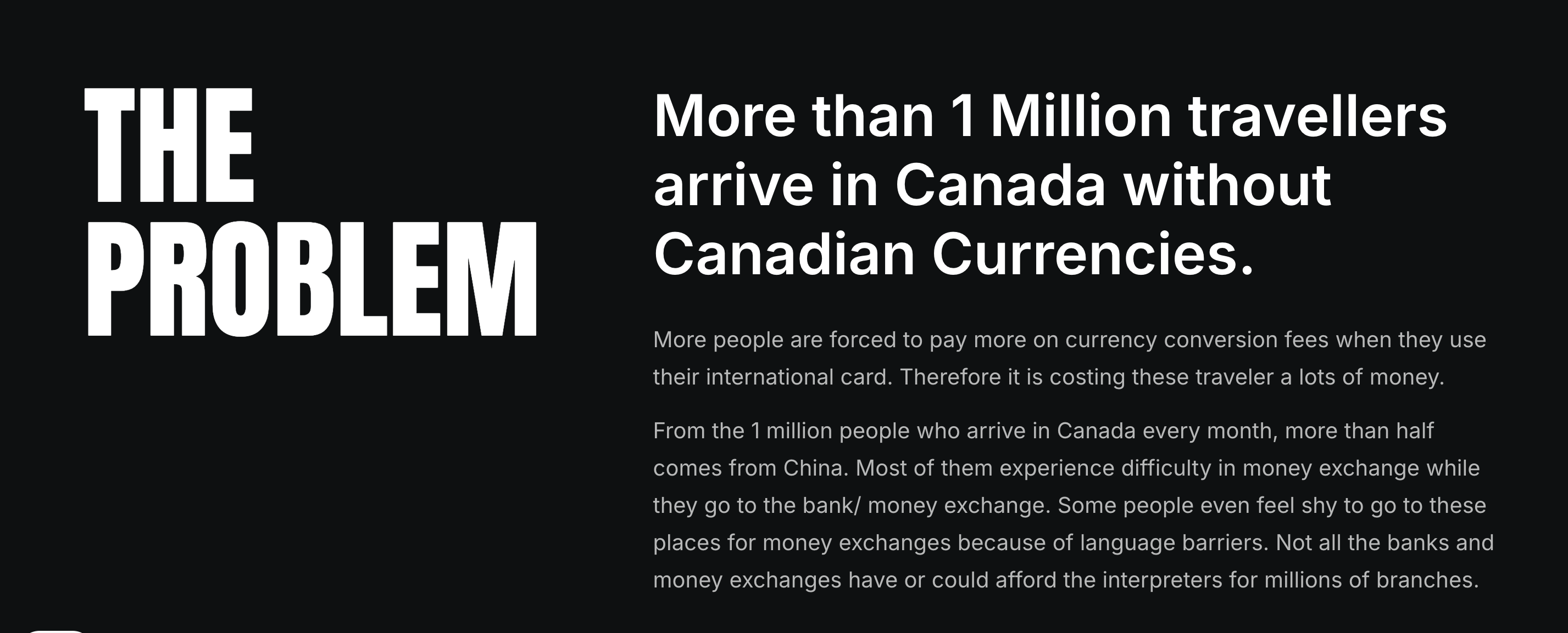
I ran interviews and desk research to find out where the friction actually lived — and it wasn't just the exchange rate.
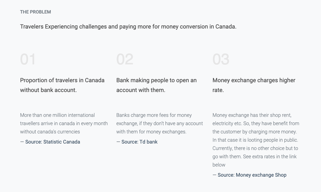
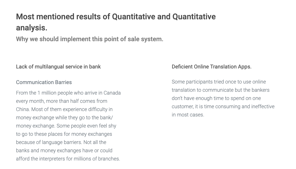
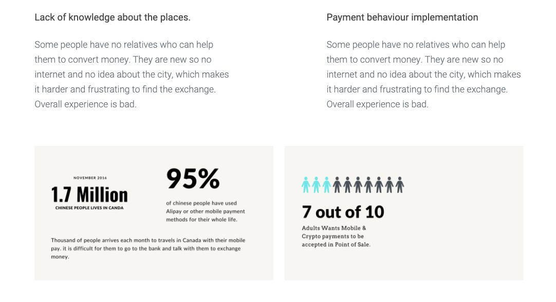
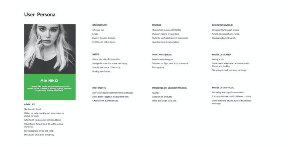
Research pointed to a recurring profile — someone financially independent, mobile-first, and frustrated by exactly the kind of friction banks were creating.
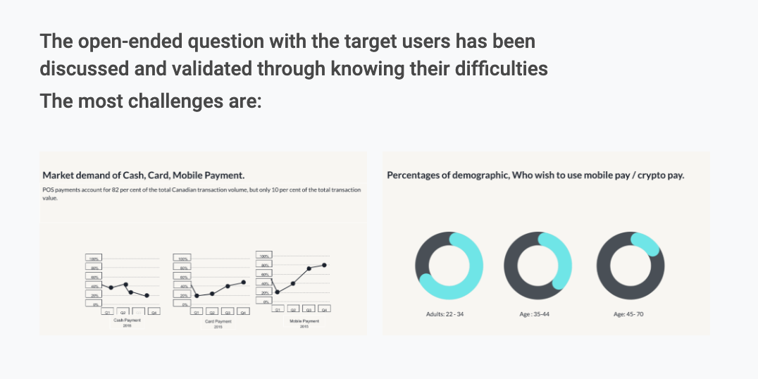
Banks that do offer multilingual service rarely advertise it — it's not on their websites or storefronts, so most travellers never find out it exists.
Most stores don't support the payment systems travellers already use, which pushes people back toward banks and exchanges — the exact friction they were trying to avoid.
And short-term visitors won't open a Canadian bank account just to get a better rate for a few days.
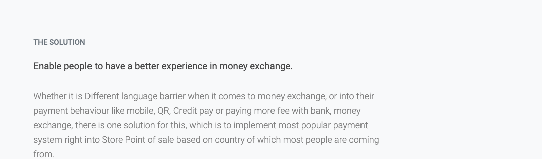
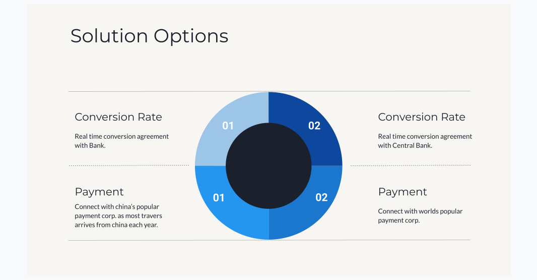
Enable a better money-exchange experience — at the point of sale itself.
Whether the friction is a language barrier or a payment method a store simply doesn't accept, the fix is the same: build the most popular payment system for a traveller's country of origin directly into the store's point of sale.
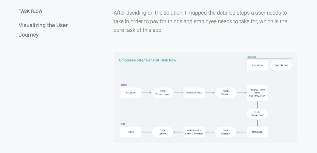
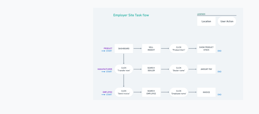
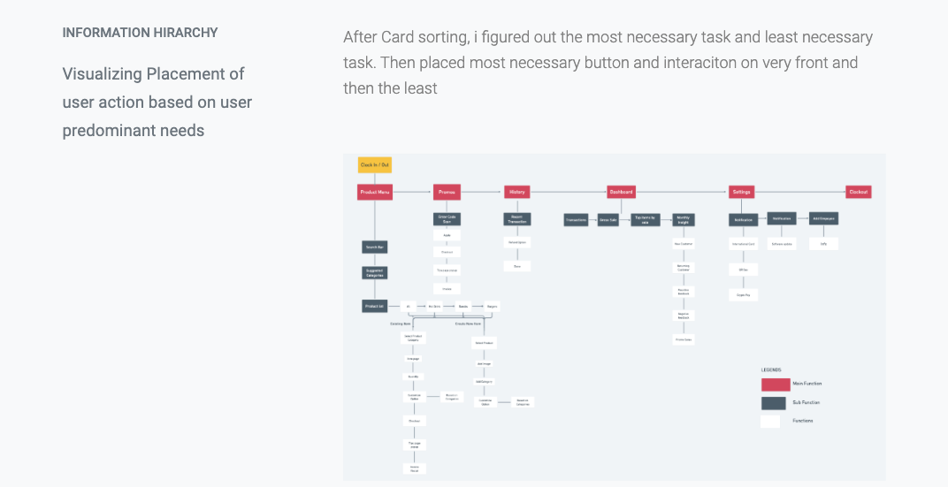
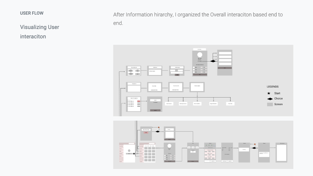
From task flows to information hierarchy to a full end-to-end user flow — before any pixel got designed.
Employee-site task flow
Employer-site task flow
Information hierarchy — placement based on how often each action is actually needed
End-to-end user flow
Wireframes — bringing the sketches to life
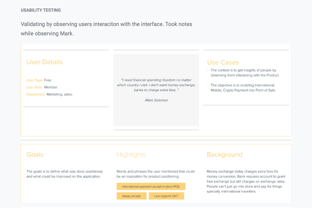
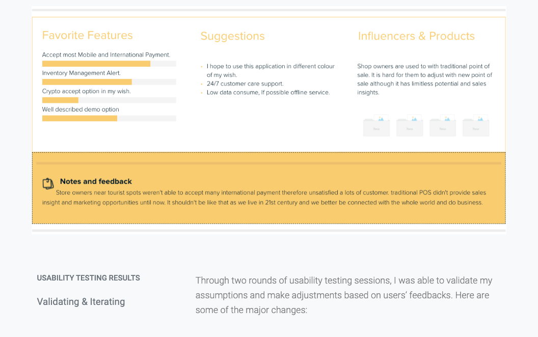
Two rounds of testing, validating assumptions against how people actually reacted to the interface.
"I need financial spending freedom no matter which country I visit. I don't want money exchange, banks to charge extra fees."
— Mark Solomon, usability test participant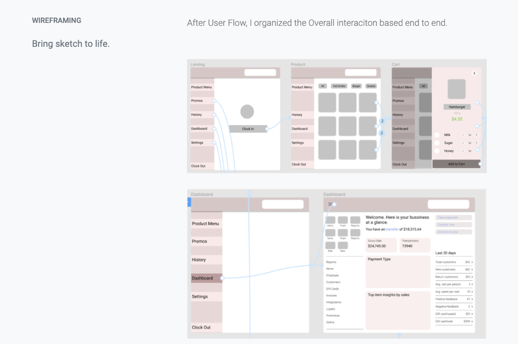
Four core screens, shaped directly by what testing surfaced.
Product menu
Category filters up top, a scannable item grid below — built so an employee can ring something up in a couple of taps, not a search.
Checkout & payment
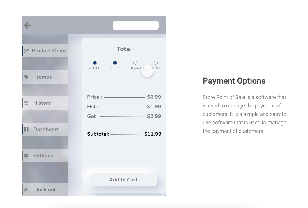
A step indicator (Added → Tipped → Checkout → Done) keeps both employee and customer oriented — and this is where mobile, QR, and crypto payment options live.
Dashboard
The owner's view — transactions, top items, payment-type breakdown, and stock alerts, so nobody runs out without warning.
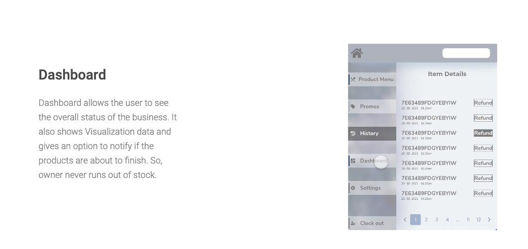
History
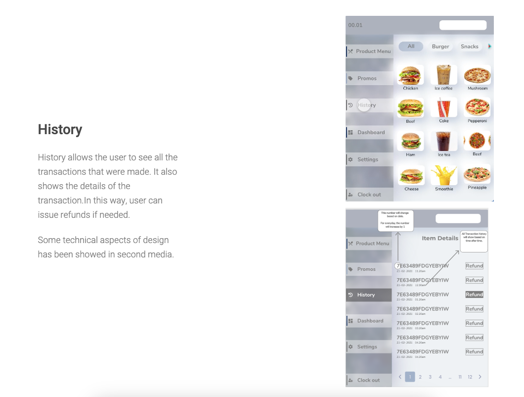
Every transaction, searchable, with refunds handled right from the list — no separate tool needed.
Proposed. Not yet decided. Still moving.
This was proposed to Moneris as a full end-to-end concept — research, UX, UI, and a business case for implementation. That decision is still in progress. In the meantime, I'm actively looking for the right partner to help bring it to market — a payment processor, a POS company, or a merchant network that feels this friction too.
Let's talk about it ↗